Insights Dashboard
See what's really happening across every client conversation
The Insights dashboard turns thousands of advisor-client meetings into a living, visual command center. Spot trending topics, track sentiment shifts, and uncover held-away assets — all without reading a single transcript. It's the macro view of your firm that no other system can give you.
Trusted by over 35,000+ advisors at top firms.


Feature Overview
Turn every meeting into a data point — automatically.
Jump automatically analyzes your advisor-client meetings and surfaces the patterns that matter most — from what clients are worried about to where opportunities are being left on the table. No manual tagging. No survey fatigue. Just answers.
What clients are talking about — and what's stopping them
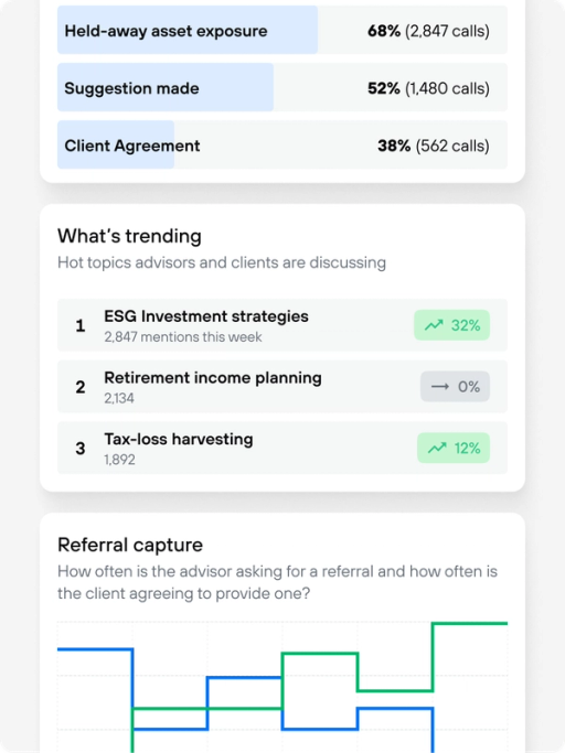
See which topics are surging across your book of business and which objections come up most often. Trending topics surface spikes like "concentration risk" or "education funding" week over week, while the objections view highlights the exact hesitations — like fee concerns or tax anxiety — that stall decisions.
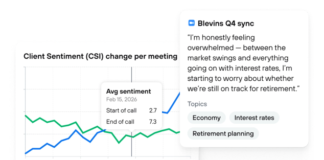
Measure how meetings actually feel
The Client Sentiment Index tracks emotional tone at the start and end of every meeting, giving you a clear read on which conversations build confidence and which leave clients uneasy. Drill into individual meetings to see exactly where sentiment shifted.
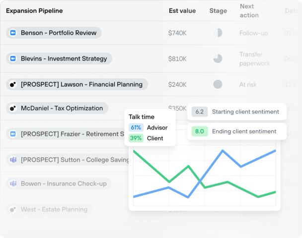
Track the pipeline hiding in plain sight
Jump identifies held-away assets mentioned in conversation, tracks whether advisors made a suggestion, and records whether the client agreed. See your firm's capture funnel — from exposure to suggestion to agreement — and pinpoint where opportunities fall through. No self-reporting required.
Understand who's driving the conversation — and where it's going
See a breakdown of which asset classes are being discussed, whether clients or advisors initiated the topic, and how client outlook (bearish, neutral, bullish) compares to advisor recommendations. It's a window into alignment — or misalignment — across your entire firm.
Stop guessing what your clients care about. Start knowing.
Most firms rely on anecdotal feedback and gut instinct to understand what clients are thinking. The Insights Dashboard replaces that guesswork with hard data drawn directly from the conversations your advisors are already having. When "mortgage planning" spikes 100% across your firm in a month, you don't need a survey to tell you it matters – you need to act on it.
Built for advisors and firm leaders
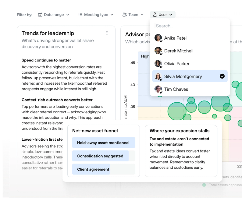
Whether you're a home office leader looking across hundreds of advisors or a solo practitioner tracking your own patterns, the Insights dashboard adapts to your role. Account owners see aggregated firm-wide data. Individual advisors see only their own meetings. Parent accounts can roll up data across child offices — with full control over granularity and privacy. Jump gives firm leaders the visibility to identify macro trends in real time, coach advisors with evidence instead of assumptions, and build firm-wide strategies grounded in what clients are actually saying. Pulse extracts those signals at scale, turning unstructured conversation into structured, trendable data without anyone changing how they work.
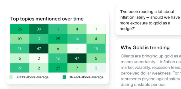
Topics over time, visualized
The heatmap view shows which topics dominated each week across your firm, so you can watch priorities shift in real time. Combine it with the topic allocation chart to see exactly how conversation time is distributed — and whether your advisors are spending time on the things that matter most.
From insight to action in one click
Every chart in the dashboard is interactive. Click a trending topic to see which meetings drove it. Drill into a sentiment score to read the moments that moved the needle. Filter by meeting type, date range, or advisor. The data is always one layer deep from the story you need.